David Carson (born September 8, 1954) is an American graphic designer. He is best known for his innovative magazine design, and use of experimentaltypography. He was the art director for the magazine Ray Gun. Carson was perhaps the most influential graphic designer of the 1990s. In particular, his widely imitated aesthetic defined the so-called "grunge typography" era.
 A stint at How magazine (a trade magazine aimed at designers) followed, and soon Carson was hired by publisher Marvin Scott Jarrett to design Ray Gun, a magazine of international standards which had music and lifestyle as its subject. Not afraid to break convention, in one issue he used Dingbat as the font for what he considered a rather dull interview with Bryan Ferry.[3] (However, the whole text was published in a legible font at the back of the same issue of RayGun, complete with a repeat of the asterisk motif). Ray Gun made Carson very well known and attracted new admirers to his work. In this period, publications such as the New York Times (May 1994) and Newsweek (1996) featured Carson and increased his publicity greatly. In 1995, Carson founded his own studio, David Carson Design, in New York City, and started to attract major clients from all over the United States. During the next three years (1995–1998), Carson was doing work for Pepsi Cola, Ray Ban (orbs project), Nike, Microsoft, Budweiser, Giorgio Armani, NBC, American Airlines and Levi Strauss Jeans, and later worked for a variety of new clients, includingAT&T, British Airways, Kodak, Lycra, Packard Bell, Sony, Suzuki, Toyota, Warner Bros., CNN, Cuervo Gold, Johnson AIDS Foundation, MTV Global, Princo, Lotus Software, Fox TV, Nissan, quiksilver,Intel, Mercedes-Benz, MGM Studios and Nine Inch Nails. He, along with Tina Meyers, designed the "crowfiti" typeface used in the film The Crow: City of Angels. He named and designed the first issue of the adventure lifestyle magazine Blue, in 1997. David designed the first issue and the first three covers, after which his assistant Christa Smith art directed and designed the magazine until its demise. Carson's cover design for the first issue was selected as one of the "top 40 magazine covers of all time" by the American Society of Magazine Editors.
-------------------------------
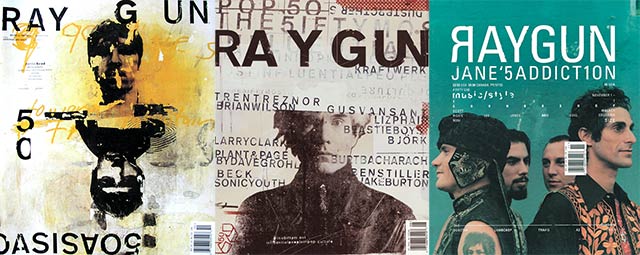
Type design was messy, words were splayed and chaotic, letters blurred. Textures were thick and heavy. Concert posters looked like someone had splattered paint on paper and then scratched out band names. You may have noticed it, you may not have, but at its peak, this typography style, called grunge, was ubiquitous. Alternative music cds, videogames, and zines—all the aggregate products of a wayward generation—appropriated its unfinished and frenzied aesthetic, and it became the largest, most cohesive movement in recent font design history.
David Carson, the acclaimed graphic designer who created Ray Gun magazine, is the so-called Godfather of Grunge. His method was simple, his gospel twofold: you don’t have to know the rules before breaking them, and never mistake legibility for communication. Carson’s technique of ripping, shredding, and remaking letters touched a nerve. His covers for Ray Gun were bold and often disorienting.
From the viewer’s perspective, the appeal of grunge was based on a basic idea: it had not been seen before. It wasn’t just the experimental design of the letters, but the way they were placed on page. Its bedlam, its body language, resonated with the culture at large. This resonance produced a vital change in typographic method: in a field that was for decades dictated by the principle of neutrality—of meaning being implicit in the text rather than the typeface—fonts were succumbing to association with the genres or ideas with which they were paired. (silent hill cover)
More: http://www.theawl.com/2012/08/grunge-typography
-------------------------------
Type design was messy, words were splayed and chaotic, letters blurred. Textures were thick and heavy. Concert posters looked like someone had splattered paint on paper and then scratched out band names. You may have noticed it, you may not have, but at its peak, this typography style, called grunge, was ubiquitous. Alternative music cds, videogames, and zines—all the aggregate products of a wayward generation—appropriated its unfinished and frenzied aesthetic, and it became the largest, most cohesive movement in recent font design history.
David Carson, the acclaimed graphic designer who created Ray Gun magazine, is the so-called Godfather of Grunge. His method was simple, his gospel twofold: you don’t have to know the rules before breaking them, and never mistake legibility for communication. Carson’s technique of ripping, shredding, and remaking letters touched a nerve. His covers for Ray Gun were bold and often disorienting.
From the viewer’s perspective, the appeal of grunge was based on a basic idea: it had not been seen before. It wasn’t just the experimental design of the letters, but the way they were placed on page. Its bedlam, its body language, resonated with the culture at large. This resonance produced a vital change in typographic method: in a field that was for decades dictated by the principle of neutrality—of meaning being implicit in the text rather than the typeface—fonts were succumbing to association with the genres or ideas with which they were paired. (silent hill cover)
More: http://www.theawl.com/2012/08/grunge-typography
No comments:
Post a Comment