http://pinktentacle.com/2009/09/design-x-japanese-graphics-from-the-early-90s/
Monday, 22 October 2012
some of the main designs 1990s
Flannel, long hair, grunge music, Seattle – the 1992 film “Singles” covered it all.
-------------------
Rave flyer from 1995.

---------------------
Google evolved quickly, cycling through three logos during 1998 and ’99.
In 1996, Stanford University computer science graduate students Larry Page and Sergey Brin built a search engine that would later become Google. That search engine was called BackRub, named for its ability to analyze "back links" to determine relevance of a particular website. Later, the two renamed their search engine Google, a play on the word Googol (meaning 1 followed by 100 zeros).
Two years later, Larry and Sergey went to Internet portals (who dominated the web back then) but couldn't get anyone interested in their technology. In 1998, they started Google, Inc. in a friend's garage, and the rest is history.
Google's first logo was created by Sergey Brin, after he taught himself to use the free graphic software GIMP. Later, an exclamation mark mimicking the Yahoo! logo was added. In 1999, Stanford's Consultant Art Professor Ruth Kedar designed the Google logo that the company uses today.
--------------------------
The first Apple logo was a complex picture of Isaac Newton sitting under an apple tree. The logo was inscribed: "Newton ... A Mind Forever Voyaging Through Strange Seas of Thought ... Alone." It was designed by Ronald Wayne, who along with Wozniak and Jobs, actually founded Apple Computer. In 1976, after only working for two weeks at Apple, Wayne relinquished his stock (10% of the company) for a one-time payment of $800 because he thought Apple was too risky! (Had he kept it, Wayne's stock would be worth billions!)
Jobs thought that the overly complex logo had something to do with the slow sales of the Apple I, so he commissioned Rob Janoff of the Regis McKenna Agency to design a new one. Janoff came up with the iconic rainbow-striped Apple logo used from 1976 to 1999.
Rumor has it that the bite on the Apple logo was a nod to Alan Turing, the father of modern computer science who committed suicide by eating a cyanide-laced apple. Janoff, however, said in an interview that though he was mindful of the "byte/bite" pun (Apple's slogan back then: "Byte into an Apple"), he designed the logo as such to "prevent the apple from looking like a cherry tomato." (Source)
In 1998, supposedly at the insistence of Jobs, who had just returned to the company, Apple replaced the rainbow logo ("the most expensive bloody logo ever designed" said Apple President Mike Scott) with a modern-looking, monochrome logo.
---------------------------
Poster by Keiji Itoh for “Life” exhibition in 1994

Sunday, 21 October 2012
Various Art styles in the 1990s
The development of computer graphics at the end of the 1980s and real time technologies then in the 1990s combined with the spreading of the Web and the Internet favored the emergence of new and various forms of interactivity art by Lynn Hershman Leeson, David Rokeby, Don Ritter, Perry Hoberman; telematic art by Roy Ascott; Internet art by Vuk Ćosić, Jodi; virtual and immersive art by Jeffrey Shaw, Maurice Benayounand large scale urban installation by Rafael Lozano-Hemmer.
Saturday, 20 October 2012
logos
http://www.tripwiremagazine.com/2012/05/photography-logos.html
http://www.etsy.com/search?includes%5B%5D=tags&q=photography+logos
http://inspirationfeed.com/inspiration/logo-inspiration/51-clever-camera-and-photography-logo-designs/
http://pinterest.com/msphotoshooter/photography-logos-branding/
http://www.etsy.com/search?includes%5B%5D=tags&q=photography+logos
http://inspirationfeed.com/inspiration/logo-inspiration/51-clever-camera-and-photography-logo-designs/
http://pinterest.com/msphotoshooter/photography-logos-branding/
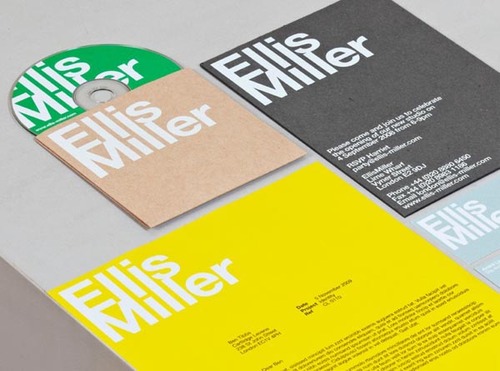
Random graphic designs
http://www.brainpickings.org/index.php/2011/11/28/best-art-design-books-2011/
http://www.citrinitas.com/history_of_viscom/computer.html
http://www.citrinitas.com/history_of_viscom/computer.html
1990s
http://blog.inkd.com/inkd_website/most-famous-logo-designers-in-graphic-design-history
------------------------------------
------------------------------------
Neville Brody
Neville Brody became famous in the 1990's for his typographic design work on numerous British magazines, in particular The Face and Arena. Brody used newly invented desktop publishing tools to the fullest and continues to be influential as a type designer for both print and web.
---------------------------------------------
David Carson
Like Neville Brody, typographer and graphic designer David Carson became influential in the late 1980's and 1990s for experimental typeface designs. David Carson's designs were featured heavily in surfing and skateboarding magazines.
A tribute to other self-taught designers, David Carson broke most of the rules of design and typography, a process that was made easy with the use of desk top publishing programs, such as Pagemaker, QuarkXpress and Illustrator. He experimented with overlapping and distorted fonts and intermixed these with striking photographic images.
------------------------------------------------
http://www.citrinitas.com/history_of_viscom/modernists.html
Some of the most famous graphic designers 1990s
Paul Rand (August 15, 1914 – November 26, 1996) was an American graphic designer, best known for his corporate logo designs, including the logos for IBM, UPS, Westinghouse, ABC, and Steve Jobs’ NeXT. He was one of the originators of the Swiss Style of graphic design.
Although his logos may be interpreted as simplistic, Rand was quick to point out in A Designer’s Art that “ideas do not need to be esoteric to be original or exciting.” His American Broadcasting Company trademark, created in 1961, then used by ABC-TV in the fall of 1962, epitomizes that ideal of minimalism while proving Rand’s point that a logo “cannot survive unless it is designed with the utmost simplicity and restraint.

Walter Landor (9 July 1913 – 9 June 1995) born Walter Landauer was a brand design legend and the founder of Landor Associates. He is a pioneer in the field of branding and consumer research. Landor Associates, the company he founded in 1941, has brand consulting and design offices all over the world today.
Probably known mostly for designing the Fedex logo.
Probably known mostly for designing the Fedex logo.

Tuesday, 16 October 2012
Photography studio
Camera technology
Ibn al-Haytham (Alhazen), the "father of optics" and pioneer of the modern scientific method, invented the camera obscura and pinhole camera.
In ancient times, Euclid and Ptolemy believed that the eyes emitted rays which enabled us to see. The first person to realise that rays of light enters the eye, rather than leaving it, was the 10th century Muslim mathematician, astronomer and physicist Ibn al-Haytham (Alhazen), who is regarded as the "father of optics".He is also credited with being the first man to shift physics from a philosophical activity to an experimental one, with his development of the scientific method. The word "camera" comes from the Arabic word qamara for a dark or private room.
http://naldzgraphics.net/inspirations/logo-design-inspiration-30-cool-photography-logos/
http://sagmeister.com/
Monday, 15 October 2012

Office stationary design packages


http://barkmultimedia.com/services/graphic-design/
Saturday, 13 October 2012
Grunge typography - David Carson
David Carson (born September 8, 1954) is an American graphic designer. He is best known for his innovative magazine design, and use of experimentaltypography. He was the art director for the magazine Ray Gun. Carson was perhaps the most influential graphic designer of the 1990s. In particular, his widely imitated aesthetic defined the so-called "grunge typography" era.
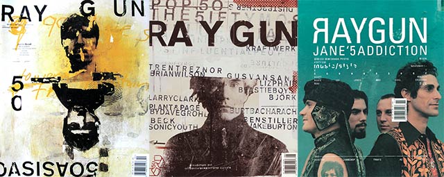 A stint at How magazine (a trade magazine aimed at designers) followed, and soon Carson was hired by publisher Marvin Scott Jarrett to design Ray Gun, a magazine of international standards which had music and lifestyle as its subject. Not afraid to break convention, in one issue he used Dingbat as the font for what he considered a rather dull interview with Bryan Ferry.[3] (However, the whole text was published in a legible font at the back of the same issue of RayGun, complete with a repeat of the asterisk motif). Ray Gun made Carson very well known and attracted new admirers to his work. In this period, publications such as the New York Times (May 1994) and Newsweek (1996) featured Carson and increased his publicity greatly. In 1995, Carson founded his own studio, David Carson Design, in New York City, and started to attract major clients from all over the United States. During the next three years (1995–1998), Carson was doing work for Pepsi Cola, Ray Ban (orbs project), Nike, Microsoft, Budweiser, Giorgio Armani, NBC, American Airlines and Levi Strauss Jeans, and later worked for a variety of new clients, includingAT&T, British Airways, Kodak, Lycra, Packard Bell, Sony, Suzuki, Toyota, Warner Bros., CNN, Cuervo Gold, Johnson AIDS Foundation, MTV Global, Princo, Lotus Software, Fox TV, Nissan, quiksilver,Intel, Mercedes-Benz, MGM Studios and Nine Inch Nails. He, along with Tina Meyers, designed the "crowfiti" typeface used in the film The Crow: City of Angels. He named and designed the first issue of the adventure lifestyle magazine Blue, in 1997. David designed the first issue and the first three covers, after which his assistant Christa Smith art directed and designed the magazine until its demise. Carson's cover design for the first issue was selected as one of the "top 40 magazine covers of all time" by the American Society of Magazine Editors.
-------------------------------
Type design was messy, words were splayed and chaotic, letters blurred. Textures were thick and heavy. Concert posters looked like someone had splattered paint on paper and then scratched out band names. You may have noticed it, you may not have, but at its peak, this typography style, called grunge, was ubiquitous. Alternative music cds, videogames, and zines—all the aggregate products of a wayward generation—appropriated its unfinished and frenzied aesthetic, and it became the largest, most cohesive movement in recent font design history.
David Carson, the acclaimed graphic designer who created Ray Gun magazine, is the so-called Godfather of Grunge. His method was simple, his gospel twofold: you don’t have to know the rules before breaking them, and never mistake legibility for communication. Carson’s technique of ripping, shredding, and remaking letters touched a nerve. His covers for Ray Gun were bold and often disorienting.
From the viewer’s perspective, the appeal of grunge was based on a basic idea: it had not been seen before. It wasn’t just the experimental design of the letters, but the way they were placed on page. Its bedlam, its body language, resonated with the culture at large. This resonance produced a vital change in typographic method: in a field that was for decades dictated by the principle of neutrality—of meaning being implicit in the text rather than the typeface—fonts were succumbing to association with the genres or ideas with which they were paired. (silent hill cover)
More: http://www.theawl.com/2012/08/grunge-typography
ART and ARCHITECTURE 1990s
Important architects and their work of this decade include Robert Venturi (winner of the coveted Pritzker Award), and Richard Meyer (Getty Museum). During these ten years, theme restaurants (Planet Hollywood). Universal design made homes and offices user friendly. Health care and elder care homes were big business for builders and architects during this decade. Green design products included bamboo flooring, a resurgence of linoleum and other environmentally friendly products.
The internet has had a huge influence on products with almost every design company having a presence on the web. "Mid-century modern" (old 50s and 60s style) made a big furnishings comeback. Feng Shui was in. Television's Martha Stewart, became the guru of home crafts and design.
Museums around the country have had long lines at major exhibits.
More about graphics 1990s
Modern computer systems, dating from the 1980s and onwards, often use a graphical user interface (GUI) to present data and information with symbols, icons and pictures, rather than text. Graphics are one of the five key elements of multimedia technology.
3D graphics became more popular in the 1990s in gaming, multimedia and animation. In 1996, Quake, one of the first fully 3D games, was released. In 1995, Toy Story, the first full-length computer-generated animation film, was released in cinemas. Since then, computer graphics have become more accurate and detailed, due to more advanced computers and better 3D modeling software applications, such as Maya, 3D Studio Max, and Cinema 4D.
Another use of computer graphics is screensavers, originally intended to preventing the layout of much-used GUIs from 'burning into' the computer screen. They have since evolved into true pieces of art, their practical purpose obsolete; modern screens are not susceptible to such burn in artifacts.
[edit]
Advertisements in the 1990s
With the advent of the ad server, marketing through the Internet opened new frontiers for advertisers and contributed to the "dot-com" boom of the 1990s. Entire corporations operated solely on advertising revenue, offering everything from coupons to free Internet access. At the turn of the 21st century, a number of websites including the search engine Google, started a change in online advertising by emphasizing contextually relevant, unobtrusive ads intended to help, rather than inundate, users. This has led to a plethora of similar efforts and an increasing trend of interactive advertising.
The share of advertising spending relative to GDP has changed little across large changes in media. For example, in the US in 1925, the main advertising media were newspapers, magazines, signs onstreetcars, and outdoor posters. Advertising spending as a share of GDP was about 2.9 percent. By 1998, television and radio had become major advertising media. Nonetheless, advertising spending as a share of GDP was slightly lower—about 2.4 percent.
The computer completely changed the industry again in the late 1990s. Designers digitally completed their illustration and design composition. Many newspapers now use direct-to-plate technology, so ad layouts are only printed for proofing purposes, if at all.
1999--Graham Routhenwaite's ads for Levi's help illustration make comeback in advertising.
1999--Graham Routhenwaite's ads for Levi's help illustration make comeback in advertising.

48 Pictures That Perfectly Capture The '90s
http://www.buzzfeed.com/mjs538/pictures-that-perfectly-capture-the-90s
Subscribe to:
Posts (Atom)