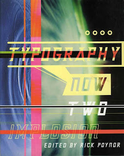
Typography Now Two: Implosion, edited by Rick Poynor in 1996
Typography Now has become a fascinating piece of history, showing us what ambitious, forward-reaching design looked like at a time when the web was just finding its legs, print was digging in its heels, and digital tools had revolutionized our work flow.
Although some of the material in Typography Now Two reeks of grunge mannerisms and digital-effects mania, much of it still looks totally alive. This work was striving to define what was new for its time, and for many pieces, the freshness stamp has yet to expire. The early ’90s was an extraordinarily fertile period.
Most of the designers featured in Poynor’s book are still active today, and some remain among the field’s most prominent figures. Yet the fervent search for new forms no longer seems to energize the larger profession. Typeface designers are focused on creating useful, solidly researched fonts for general communications rather than high-concept faces addressing questions of chance, decay, and technological breakdown. New modes of experimentation have emerged in areas such as system design, code-driven graphics, and data visualization. Although these areas can yield astonishing visual results, a sense of order and sobriety prevails.
------------------------------------------------------------------------
As the 1990s began,graphic designers reacted to the
International Style and sought to break away from the
constraints of the grid patterns in favour of experimentation,
playful use of type and a more handmade approach.Type
use became more subtle and expressive – to be part of the
message rather than just its conveyor.
http://my.safaribooksonline.com/book/graphic-design/9782940439973/a-brief-history/1990s

No comments:
Post a Comment